St. Clair Foods
Project Tasks: Branding, Overseeing Media Shoot, Product Flyer Design
Results
Guided the brand through a visual update that set the tone for future product marketing.
Provided the sales team with an updated, polished asset to share with distributors and partners.
Transformed the brand’s presentation with fresh photography and a modern color palette.
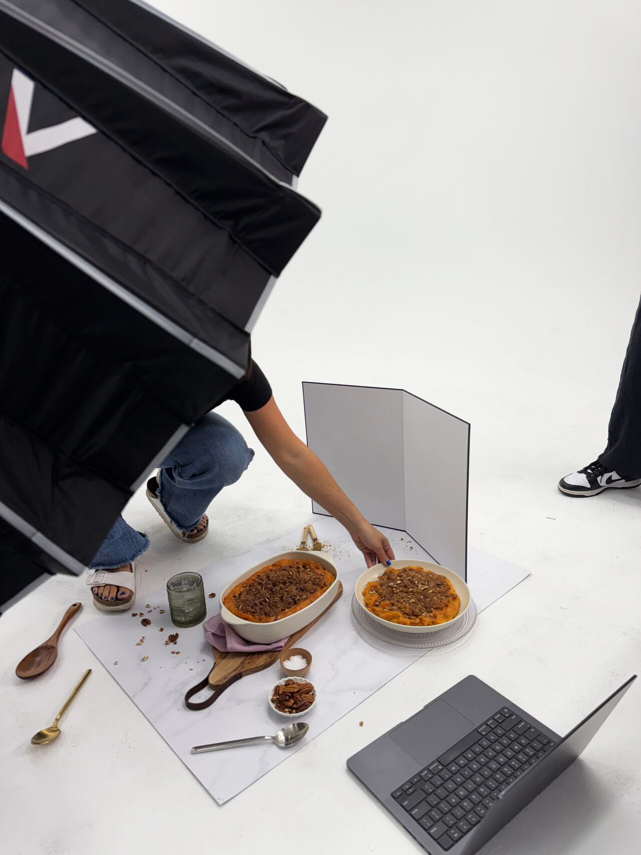
Overview
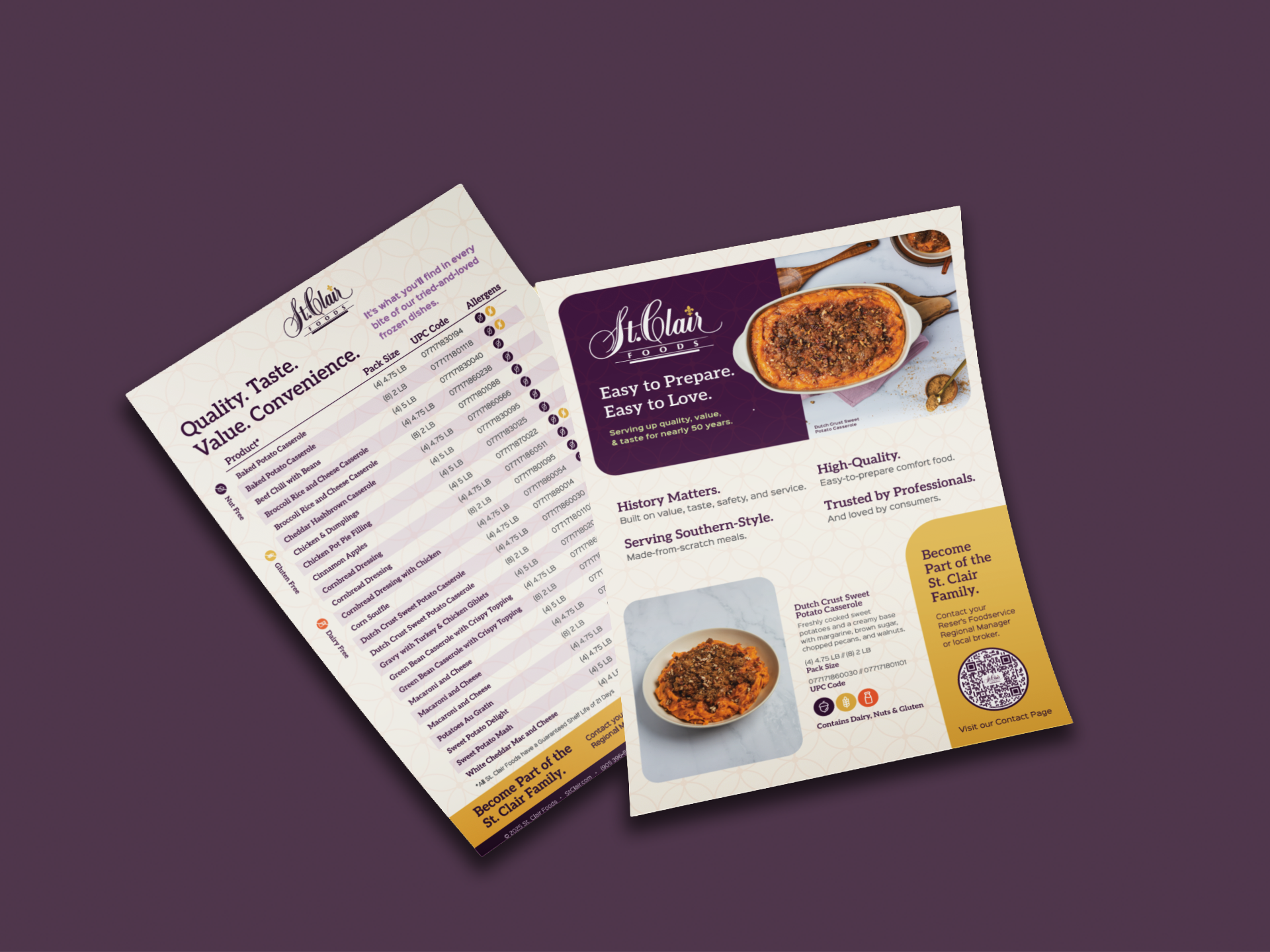
St. Clair Foods came to us looking to refresh their sell sheet for their signature Dutch Sweet Potato Casserole. I guided the creative direction from concept to execution, beginning with a brand mood board that introduced a more modern and appetizing aesthetic.
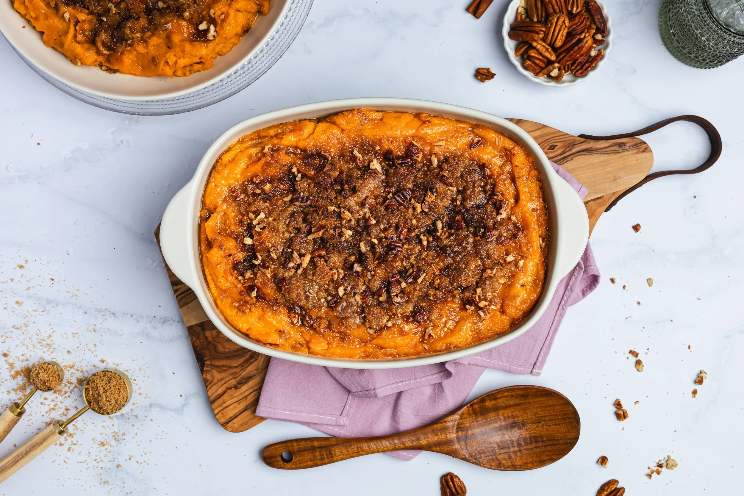
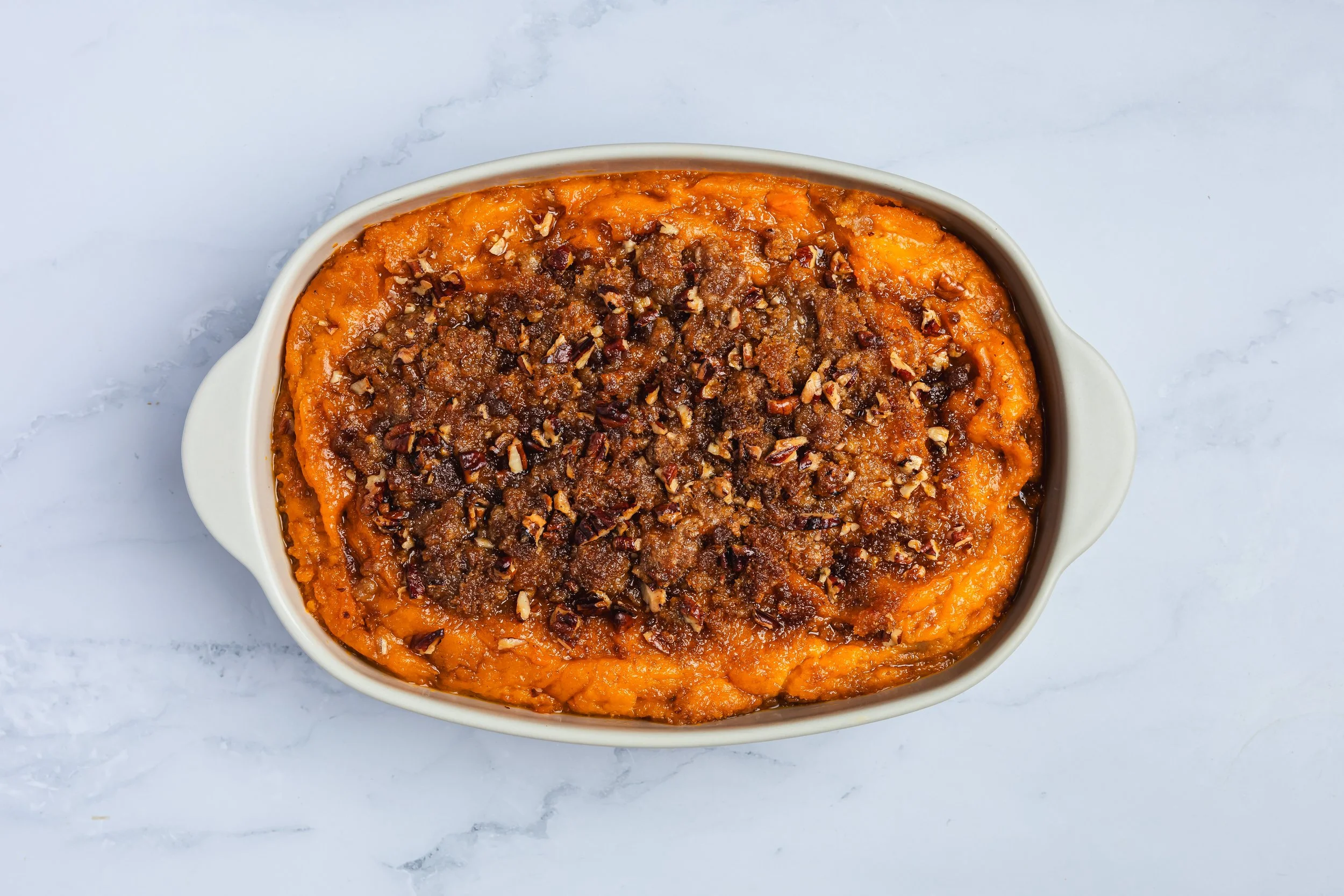
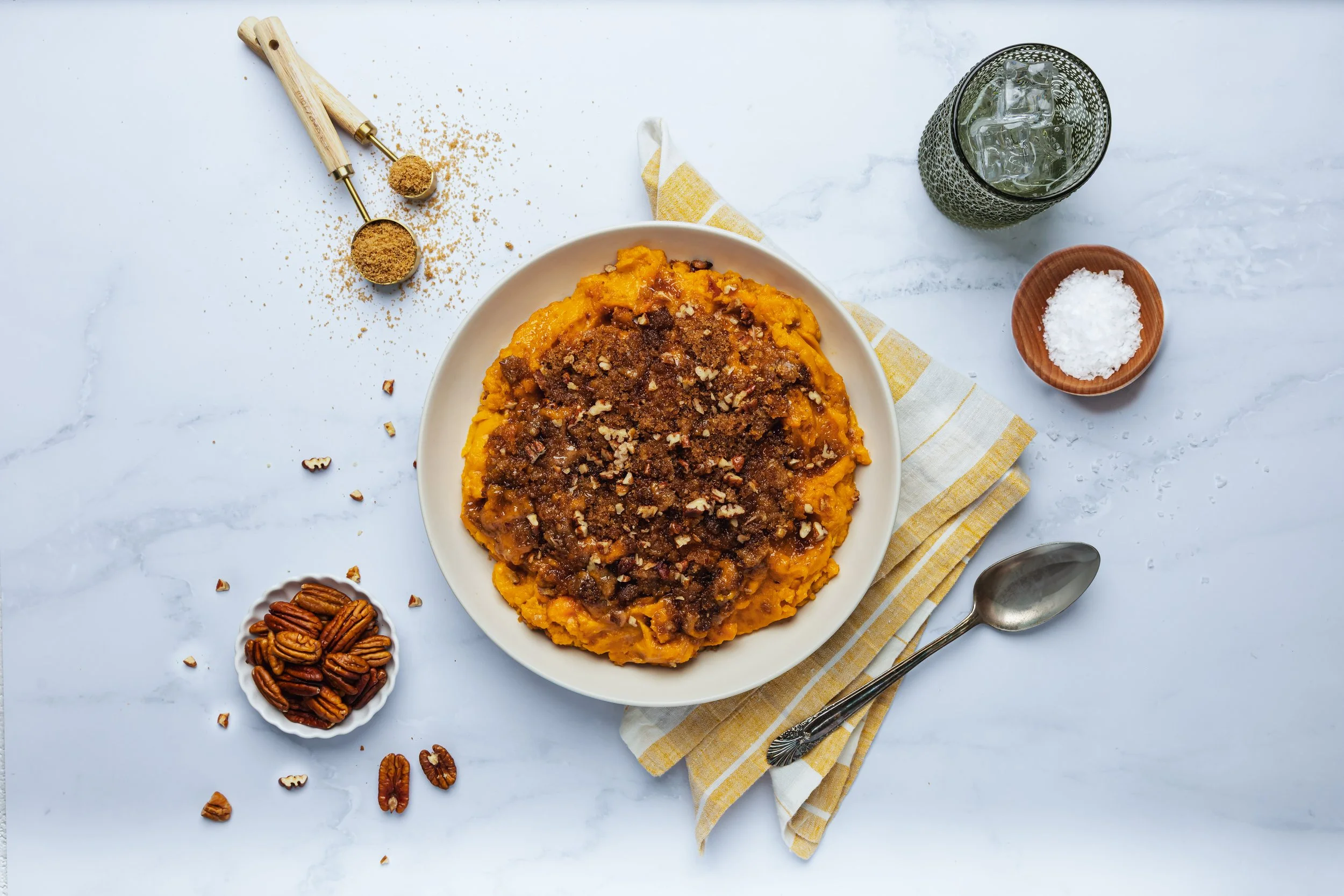
To capture the product at its best, I oversaw a photoshoot — sourcing props, setting the visual tone, and ensuring the dish was styled to highlight its warmth and homemade appeal. Alongside the photography, I developed a refreshed brand palette that extended beyond the casserole to unify their wider product line.
The end result was more than a sell sheet update; it was a brand refresh that elevated St. Clair’s identity, making their products stand out with a cohesive and inviting visual presence.