Daily Daughter Senior Care
Project Tasks: Branding, Logo, Brochure, & Website Design
Results
Guided the brand through a visual update that set the tone for future marketing.
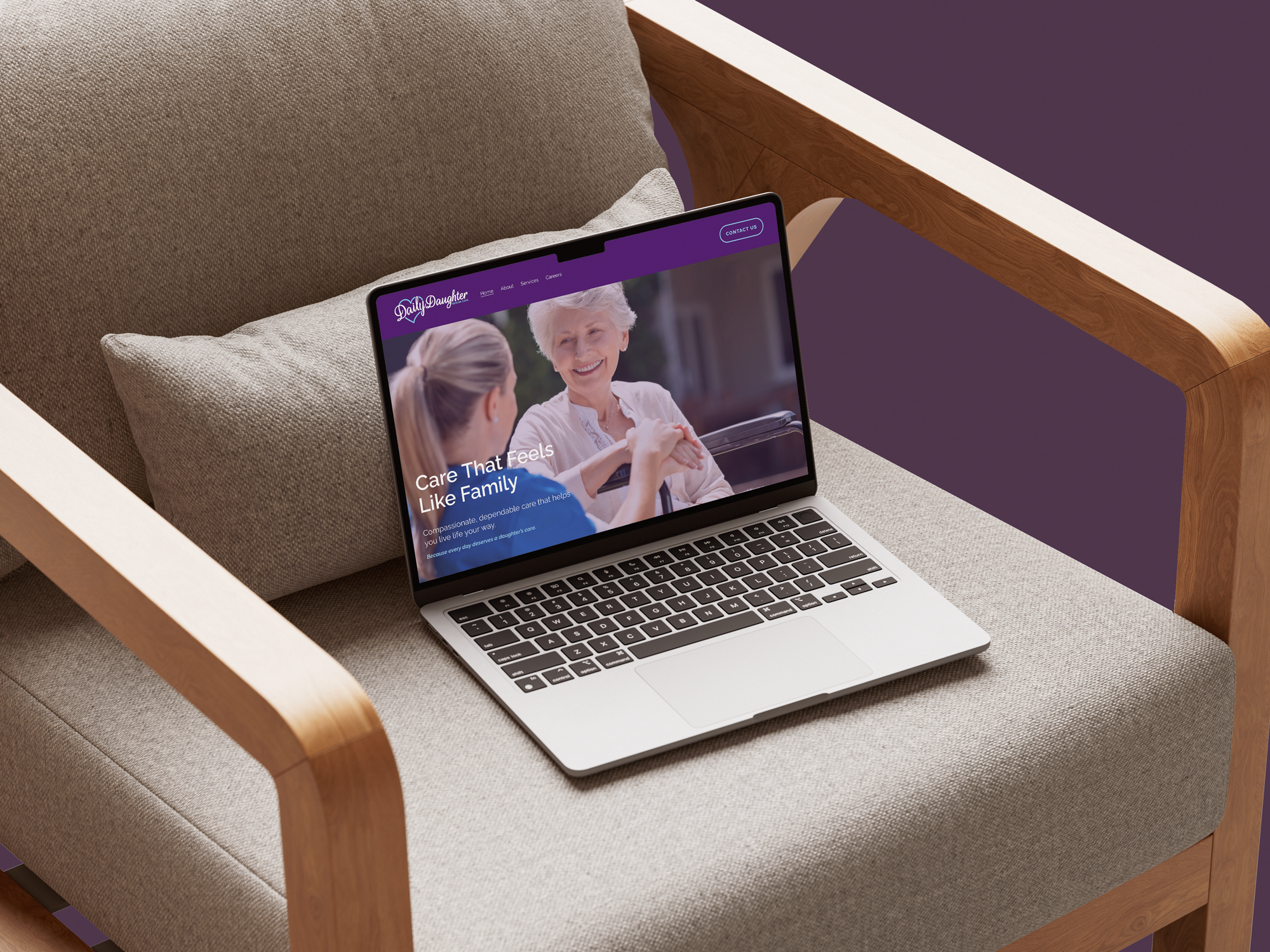
Provided the team with an updated, polished website to share with customers and prospects.
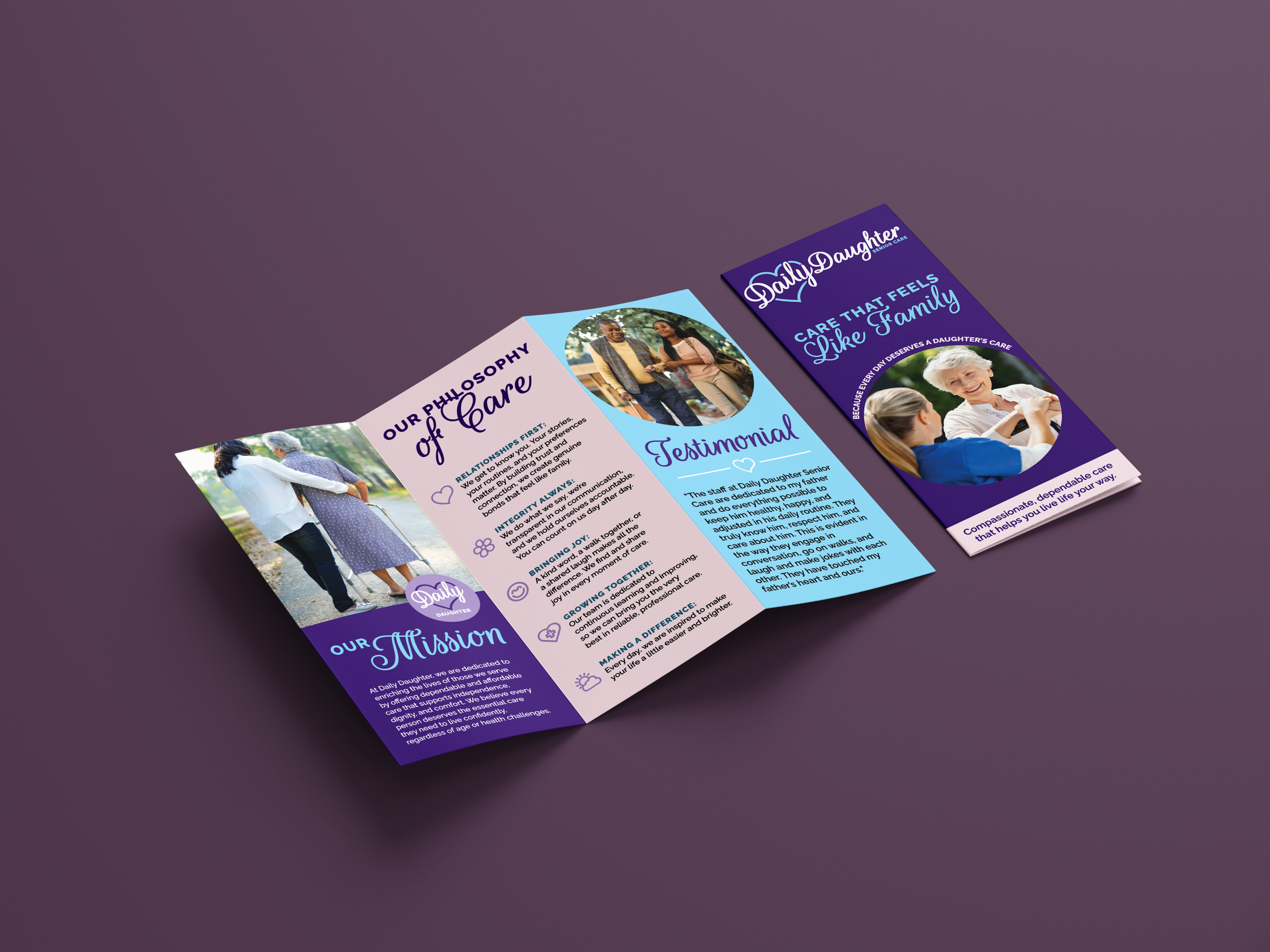
Created a brochure that clearly communicated the brand’s mission, values, and services.
Overview
Daily Daughter came to me seeking a brand refresh that would better reflect their personality and audience. Their existing identity felt outdated, and the goal was to create a look that felt vibrant, playful, and modern while staying true to their mission.
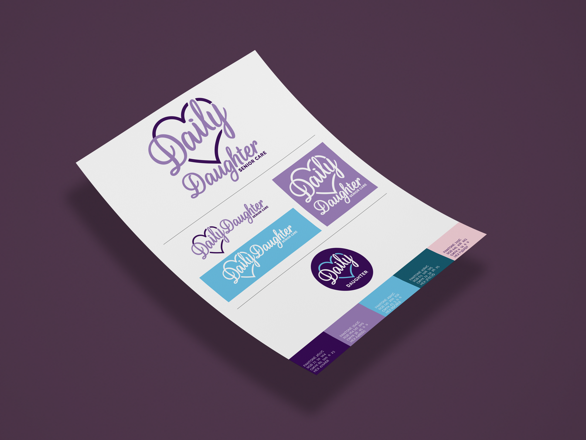
I began by developing three distinct logo concepts, giving the client a range of visual directions to explore. Once a final direction was selected, I created a concise one-page brand sheet and a full set of logo variations to ensure consistency across platforms.
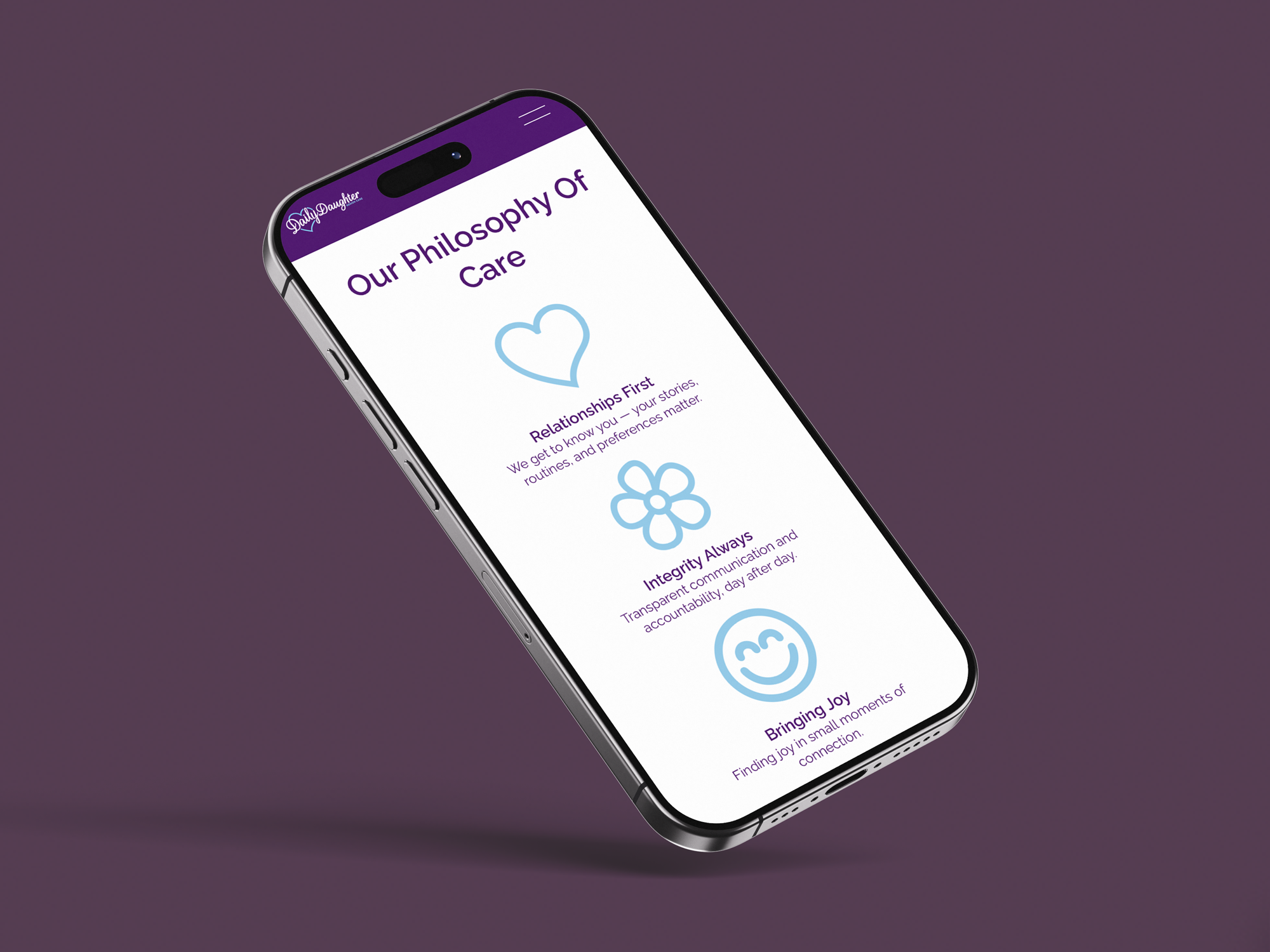
From there, we expanded the refreshed identity into key brand touchpoints, including a trifold brochure outlining Daily Daughter’s mission, values, and services. The project concluded with a streamlined website refresh, where I focused on retaining only the most essential pages to improve clarity, usability, and impact.
The result was a cohesive, updated brand system that feels approachable, joyful, and aligned with Daily Daughter’s vision for growth.